Before roof pillars got thicker, thus escalating “visibility” to my No. 1 pet peeve, control layouts headed my list of automotive annoyances.
Auto Control Layouts
This is slightly different than control complexity, in which you get the sense that a 12-year-old video-game junkie dreamed up the “logic” used to access the tidal wave of new-age electronic functions, and that drivers should be concentrating on the genius of his work rather than on guiding a two-ton projectile down the road. No, this has more to do with placement and simplicity of use.
Unlike visibility, control layouts have actually gotten better over the past few years. It used to be common that climate controls, in particular, were mounted low and recessed into the dash, making them a long, awkward reach away. That’s less often a problem nowadays, but many cars still don’t seem to place a high priority on making controls easy to reach, easy to use, and clear in their functions.
Just Take the Bus: 3 Things Truly Dangerous Drivers Do
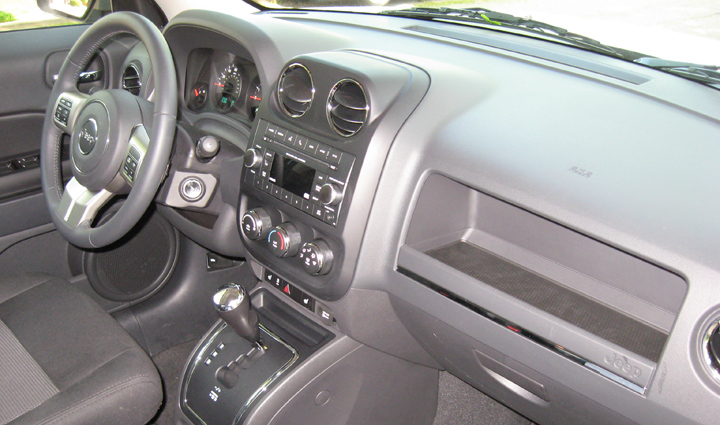
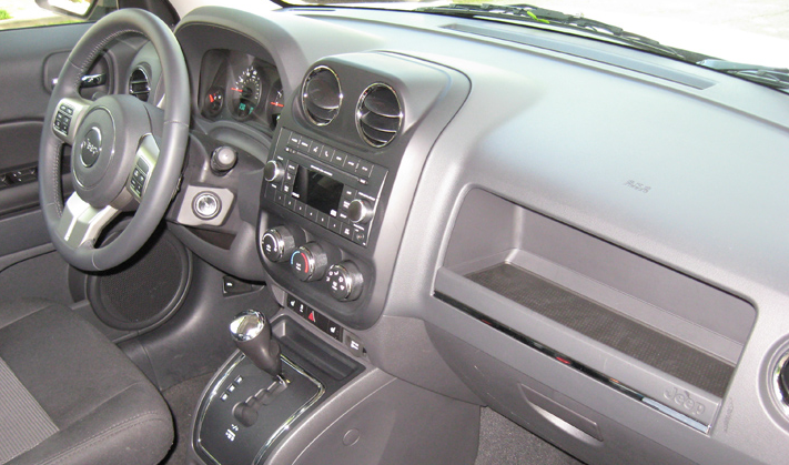
So it was a refreshing change when I stepped into our test Jeep Patriot last weekend. Right there, positioned high on the dash and within a hand-span of the steering wheel, were the audio and climate controls. Not only were the radio controls easy to decipher, but a small screen displayed what channel was assigned to each of the station-select buttons—a nice touch. Climate controls consisted of three simple, easy-to-use dials. And when I went to reset the odometer for the next driver, I could do so by simply pressing a button that projected from the instrument panel. It’s amazing how many cars make this procedure stupefyingly complicated. My only complaint was that while the windshield wipers got their own stalk to the right of the steering wheel, they were activated by a rotary knob (on many cars it’s located instead at the end of the turn-signal stalk) rather than by flipping the stalk up and down, which I find more convenient.
Granted, this Patriot was a base-level model with few frills, and its dash was not the handsomest or best trimmed I’ve ever seen. But form and function don’t have to be mutually exclusive.
Several years ago, when it first came out, we had the opportunity to test a base-model Volkswagen CC—a midsize, mid-priced, 4-door sedan. After getting in and marveling at the stately beauty, rich materials, and simple layout of the panel facing me, I wanted to rip that dash out of the car, put one on the desk of every interior designer in the industry, and say, “This is how it’s supposed to be done.” It still stands as the high-water mark for interiors in my book.
The Frustrated Commuter’s Creed: A 10-Point Pledge
However, neither of these cars had a navigation system—or the control complication it brings. In many cars so equipped, the navigation screen slots in the dash where the audio system normally resides, so the designer’s only recourse is to morph the audio controls into virtual buttons on the navigation screen. This rarely works well. Worse, some manufacturers put oft-used controls on the console, which require a long look from the road to adjust.
Almost universally among the worst in this regard are the German luxury makes. That’s particularly confounding to us old-timers, as—20 years ago—these were some of the same manufacturers who bucked the trend toward installing cupholders in their cars, ostensibly because they didn’t want to encourage the distractive act of drinking a can of pop while driving. Some manufacturers have even incorporated seat-heater controls into the screen, demanding guesswork and multiple steps just to warm your buns.
Stop it! 5 Habits to Break for Better Mileage
Conversely, one of the best is Infiniti. The company’s strategy is simple: Navigation controls are grouped around the screen in a separate panel atop the dash, with only a couple of audio controls mixed in. Major audio and climate controls are separate and grouped together.
The controls themselves differ as well. Even something as basic as the climate system can be easy or tedious to adjust, depending on the controls chosen. Worst are the “repetitive-step” pushbuttons that are often used for fan speed, temperature, and mode. These drive me nuts. Going from my usual 70-degree setting to, say, 80 degrees for a quick winter warm-up requires pushing that #$%& button 10 times. Ditto for fan speed and mode, the latter of which requires a look down for every press to see whether you’ve chosen floor, dash, floor and dash, defrost, or floor and defrost. Best are rotary dials that can be quickly spun to the desired position, though some that separate mode functions into separate buttons work great, too.
Whenever assessing auto control layouts, I try to keep in mind that we drive a car for only a few days, whereas an owner drives it far longer—and presumably learns whatever idiosyncrasies it has. But that doesn’t excuse or lessen the danger inherent in layouts that require multiple steps to perform what should be simple tasks or place controls in awkward locations, as both take your eyes and concentration off the very important task of driving.
My No. 1 Pet Peeve: Visibility
My No. 2 Pet Peeve: Transmission Responsiveness
Auto Control Layouts
