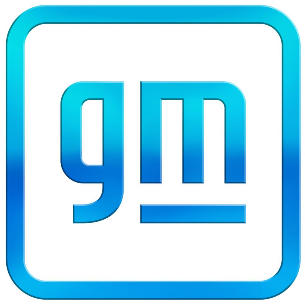
 General Motors is changing its corporate logo as part of its move towards building an all-electric vehicle lineup. It is only the fifth time the carmaker has redesigned its logo since the company’s inception in 1908.
Gods, Diamonds, and Mystical Beasts: Explore the Fascinating World of Car Company Logos
New GM Logo

Per today’s announcement:
As GM amplifies its EV message, it has also created a revitalized brand identity designed for a digital-first environment. The new logo builds on a strong heritage while bringing a more modern and vibrant look to GM’s familiar blue square. The new brand identity extends to technology brands including Ultium. The team of GM designers tasked with creating the new logo considered how to balance the history and trust inherent to the existing design with GM’s vision for the future.
According to Sharon Gauci, GM executive director of Global Industrial Design: “This was a project our team took so personally, not just for ourselves but for the 164,000 employees this logo represents. At every step we wanted to be intentional and deliberate because this logo signifies creative and innovative thinking across the global General Motors family.”
The new GM logo features a color gradient of vibrant blue tones, evoking the clean skies of a zero-emissions future and the energy of the Ultium platform. The rounded edges and lower-case font create a more modern, inclusive feel. The underline of the “m” connects to the previous GM logos as well as visually representing the Ultium platform. And within the negative space of the “m” is a nod to the shape of an electrical plug.
Fahrvergnügen (and 4 Other Obnoxious Automotive Marketing Terms)
What do you think of the new General Motors logo? The place to leave comments is down below.
Listen to the very entertaining Consumer Guide Car Stuff Podcast
New GM Logo


