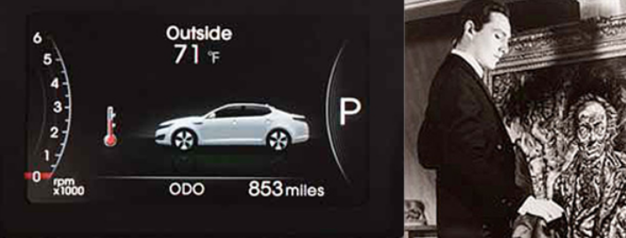
I recently tested three versions of the 2012 Kia Optima, and I noticed in each one that the vehicle-information display, between the speedometer and tachometer, contains a little picture of the car. The image is always displayed and, curiously, varies with model: a profile view in one, a rear-three-quarter angle in another, a front aspect in the third.
Steve and Johnnie Road Test: 2016 Kia Optima SX-L
At first I wondered what Kia was doing here, as these are still images that seem to serve only as space-fillers. Then the thought occurred to me that they might have a faintly insidious purpose akin to the theme of the Oscar Wilde novel The Picture of Dorian Gray, only in reverse. Consider that the actual car inevitably ages, becoming dingy and dinged, but the picture stays the same, always there to remind you of the vehicle in its original pristine condition. Perhaps Kia hopes that the ravages of time will generate feelings of discontent and embarrassment that will eventually drive the owner to trade his/her old ride for a brand-new Optima, which by then will probably be a brand-new design.
This got me to thinking about the American auto industry’s “planned obsolescence” business model of the 1950s, symbolized by the major yearly styling changes that Detroit banked on to move the metal and keep revenues flowing. It’s the same “tyranny of fashion” gambit that has ruled the apparel industry forever: in style one season, old news the next. This tactic is also known as “keeping up with the Joneses.” The idea is that making people sufficiently dissatisfied with an “old” thing encourages them to buy a “new” version, even though the former may still be perfectly useful and the latter only superficially better.
Buick took this a silly step further by putting the model year on the grille emblems of its 1955, ’56, and ’57 cars. Unfortunately for whatever genius approved this ploy, it did nothing for sales and played hob with trade-in values. But you know what? Planned obsolescence is alive and well today. Consider Apple’s frequent product improvements like the iPad2 and iPhone4, or Mattel and its never-ending flow of new Barbie fashions and Hot Wheels.
Let’s face it, folks: One way or another, we’ve all become puppets of the corporate marketers. The only differences among us are how high we jump, how soon, and for how much money whenever they yank our emotional strings.
Back to test cars. Unsurprisingly, perhaps, Kia-parent Hyundai has a picture in the vehicle-info display of its sporty Veloster coupe, only it’s an image of the red 2-door Veloster concept, which to my eye is much more attractive than the gawky 3-door it morphed into. Is Hyundai tacitly admitting that it messed up on the production styling? If it isn’t, then why use the image of a one-off design that may well taunt the owner day in and day out?
Did I mention that car companies sometimes do really goofy, er, stuff?
Rolex and Lamborghini: The Blunt Instruments of the Enthusiast World


