I have a few more thoughts about the distracted-driving hazard of today’s infotainment systems and other electronic wonders. Let’s start with the obvious fact that these features aren’t going away. People keep buying them, and manufacturers make big money on them. That’s why it’s hard to find a new car that doesn’t have a video screen, even if it’s only for the radio, as in my low-options 2010 VW Jetta TDI wagon.
And we’ve only just begun. For example, trade weekly Automotive News recently ran a story headlined “iPhone on wheels: It’s getting closer.” Oh, dear. It’s bad enough to have factory audio systems so powerful that drivers can’t hear critical outside noises—an approaching fire engine, for instance. Now we have cars that are rolling Internet cafes. What’s next? The in-car holodeck?
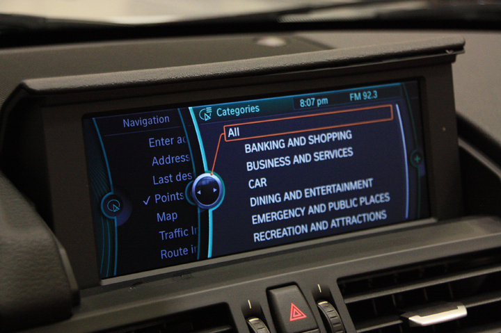
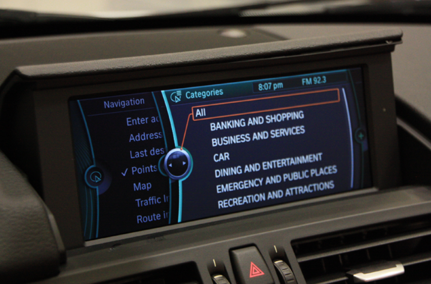
“It’s an idea that I don’t think really belongs in a car to a certain extent. . . . It is a very complex system that they’ve put in, that works great if you’re in a showroom and not having to look at where you’re going.” That’s David Champion, director of vehicle testing for Consumer Reports magazine, speaking to The New York Times. He was discussing MyFord Touch, the reigning Edsel of vehicle infotainment setups, but his comment applies no less to Audi’s MMI, BMW’s iDrive, Mercedes’ COMAND, and similar systems.
These “master controllers” have the laudable aim of centralizing the multitude of settings and readouts that go with today’s feature-laden vehicles, but they’re all seriously distracting, and probably always will be. There are several problems. First, many cars have simply acquired too much tech. Progress is all very well, but just because you can do something doesn’t mean you should. I mean, does anyone really need electronic adjustment for the airflow rate of the dash vents or to go through half a dozen steps to set a radio station? Sure, an owner would eventually become familiar with a particular system and would seldom need to drill-down to secondary and tertiary functions once they’re set. But that’s not the point. It’s how these systems over-complicate simple, common tasks, such as changing the A/C fan speed.
This brings us back to MyFord Touch. It was supposed to boost Ford’s sales and brand image, especially among tech-savvy youth. Instead, the slow, finicky, hard-to-use contraption contributed to a sharp drop in Ford’s customer-satisfaction ratings. Indeed, the brand fell from fifth to 10th on CR’s 2012 Automotive Report Card and plunged from fifth to 23rd in J. D. Powers’ latest Initial Quality Survey.
No wonder Ford was quick to acknowledge initial glitches with MFT and its underlying Sync voice-command software (developed with Microsoft, as an Apple-loving friend never tires of mentioning to this Windows user). Ford has also been good about issuing Microsoft-like “patches” and upgrades. Meanwhile, the company brags that MFT helped clinch no less than 56 percent of 2011 Ford-brand sales, with an astonishing 80-percent take for the Explorer and Edge SUVs. Ford also says 77 percent of MFT owners use the system’s voice-command facility instead of the touchscreen to make various adjustments.
Okay, but some of those customers must have attended the tutorials that many Ford dealers have put on at the company’s urging, a development that sounds an awful lot like damage control, a tacit admission that MFT was conceptual overkill. You can say the same for BMW’s iDrive. It keeps improving, yet each new version comes with more “hard” buttons than the previous one—ironic, given that the original goal was to eliminate as many buttons as possible in favor of the one big magic knob. And though iDrive is more user-friendly than it was, it’s still as distracting as any of its ilk.
The big problem with a dashboard display screen, plain or touch-sensitive, is that the driver has to look at it to make adjustments or take in information, and that means diverting attention from the immediate task of driving for several, possibly critical seconds. It may have 3D graphics, but a dashboard screen is basically a two-dimensional device. What we need are 3D controls placed within the driver’s peripheral vision and shaped so they can be identified and adjusted pretty much by feel alone. That’s one thing I always loved about my 1986 Honda Accord. You didn’t have to search for the volume knob or fan-speed slider. You just reached over a little, felt around a bit, and changed the setting. No-brainer ergonomics.
I do wish automakers get back to that kind of tactile simplicity, the thing that makes steering-column stalks so brilliant, so valuable. But, of course, it’s a forlorn hope, what with so many people now mesmerized by glowing screens that they can’t tear themselves away, seemingly desperate to be entertained and connected no matter what, no matter where, no matter when. Maybe I’m too old, but I just don’t get that. Facebook and Twitter might have helped topple tyrants in the Middle East, but they’re no substitute for good old face-to-face conversation.
The auto industry and now government seem to believe that voice control is the answer to distracted driving, perhaps after seeing those TV commercials where bright young things interact with their iPhones using plain everyday speech. Apple’s Siri voice-recognition software may indeed rival the intelligence of the Starship Enterprise computer, but I have my doubts. And if Siri really is that smart, then the auto industry should adopt it as a universal standard, rather than each company pushing its own system with specific vocabularies.
In the end, though—and at the risk of sounding preachy—only you, the motorist, can prevent distracted driving. No phone call, no text message, no e-mail is so urgent as to be worth risking your life for while behind the wheel. Please think about that—and by all means, spread the word.
The Frustrated Commuter’s Creed: A 10-Point Pledge


