Text by Dave Aretha
Through their logos, many automakers have created a dazzling world of wonder. In logo land, you’ll discover roman gods, prancing horses, and mystical beasts—as well as religious themes such as the Holy Trinity and the Christian Crusades. It’s a universe of stars and planets, ships and rockets, diamonds and domination. One emblem, which is simply a crooked letter, symbolizes a trustworthy handshake. Car Company Logos.
Disappointingly, such companies as Volkswagen (whose symbol is VW) and Ford (Ford) have refused to join in the fun. But many of the other logos have fascinating meanings. Let’s explore:
The 4 Most Important Vehicles of the Past 30 Years
Car Company Logos
Acura
The Acura logo plays with our minds a little. Most observers think the logo is a stylized letter A, for Acura, just like Honda’s logo is a stylized H for Honda. But according to Honda (Acura’s parent company), the image is a caliper, a design instrument used for measuring thickness. Scroll down for more car company logos.
Alfa Romeo
The Alfa Romeo badge pays tribute to its home city, Milan, Italy. It features the city’s coat of arms, which symbolizes Milan’s two ruling families during medieval times. On the left is a red cross, a Christian symbol of heraldry that represents the right of a person to bear arms. On the right, a serpent devours a human being, interpreted by some as a Muslim—that is, the enemy of the Christians during the Crusades.
Marketing Madness! An Ad Gallery of Co-Branded Cars
Audi
In Latin, Audi means “Hark,” as in “Hark! Who goes there?” The company’s logo—four-linked circles—is less interesting. It simply represents the 1932 merger of Saxony’s four car companies: Audi, DKW, Horch, and Wanderer. But it was still better to use four circles than to squish all those names onto one badge.
Baby Bronco: What’s in a name?
BMW
BMW’s circular emblem, with its two white quadrants and two blue quadrants, has nothing to do with automobiles. Before BMW began building cars, it manufactured engines for airplanes. The logo represents a white propeller spinning in a blue sky. Very cool.
Canadian Confusion: GM’s Short-Lived Passport Dealerships
Buick
This one’s personal. The company’s founder, David Dunbar Buick, hailed from Scotland. The emblem is simply his ancestral coat of arms.
Hollywood Madness! 12 Classic Celebrity Car Commercials
Cadillac
The Cadillac logo is the family coat of arms of Antoine Laumet de La Mothe, sieur de Cadillac, who founded Detroit in 1701. Impressively, GM’s Cadillac division has used the logo uninterrupted since 1905. The birds, called merlettes, are in two groups of three, which represent the Holy Trinity. The colors have meaning, too. Blue represents valor, silver is for purity, and red is for boldness. The crowns represents the ancient counts of France.
12 Classic Chevrolet Trucks (Gallery)
Chevrolet
It’s a little disconcerting that the logo for Chevrolet—the company that identified itself with baseball, hot dogs, and apple pie—was inspired by (gulp) the French! Several stories about the emblem’s history exist. But according to the most popular version, Chevrolet cofounder William Durant was inspired by a pattern he saw on wallpaper in a Paris hotel. It’s enough to make Hank Hill shudder.
Worst Car Commercials: The 80s
Chrysler
In the current Chrysler logo, at the center of the wings, is the original Chrysler emblem. It is a rendition of a wax seal, with a ribbon on the lower right. It seems pretty simple, but examine it more closely. The lines that look like thunderbolts are actually Zs, a tribute to one-time chief engineer Fred Zeder.
Should I Buy A Car From JD Byrider?
Dodge
Some 80 years ago, sculptor Avard T. Fairbanks created a dynamic hood ornament for Dodge—a powerful ram lunging forward. Subsequent logos included the Dodge family coat of arms, forward arrows, a fratzog (a three-pointed star composed of silver arrowheads pointing outward), a pentastar, and then, beginning in 1993, a ram again. The horned animal appeared on Dodge’s entire fleet, not just its Ram trucks. The dynamics changed in 2010 when the Dodge Ram was spun off into its own division, known simply as Ram. Dodge thus unveiled a new but uninspiring logo: the word Dodge with two red slashes next to the e. Avard Fairbanks, we need you! Scroll down for more car company logos
Ferrari
Ferrari automobiles have plenty of horsepower, making the “Prancing Horse” emblem appropriate. The logo also has a cool story behind it. On June 17, 1923, company founder Enzo Ferrari met Italian Countess Paolina Baracca. Her son, ace fighter pilot Francesco Baracca, had won 34 duels for Italy during World War I before being shot down. Barraca’s plane had featured the Prancing Horse, and his mother suggested to Ferrari that he adopt the symbol, for it would bring good luck. The countess was right. In time, Ferrari’s company would be valued at more than $3 billion.
Hyundai
That’s not just a crooked H that you see on the Hyundai grill. The design symbolizes two people—a company representative and a satisfied customer—shaking hands. The oval correctly indicates Hyundai’s global expansion; it has been one of the world’s fastest-growing automakers.
Rand Road Revisited: A Used Car Dealer Gallery
Infiniti
In 1989, the firm Lippincott & Margulies created both the name and logo for Nissan’s upcoming luxury line. The company explains: “The name ‘Infiniti’ was chosen to communicate the endless potential for satisfaction among owners of a car with superb comfort, reliability, and luxury.” The logo is a stylized version of the symbol for infinity, which looks like a sideways 8.
Fifteen Shades of Gray: How an Industry Brands Dull
Lamborghini
Though it’s visually striking, the content of the Lamborghini emblem doesn’t seem right. Why did they choose a bull, which would seem more appropriate for trucks than high-performance sports cars? The answer is that company founder Ferruccio Lamborghini was born on April 28. The bull was chosen to represent his Zodiac sign, Taurus. The other irksome property of the Lamborghini emblem is that it looks like Ferrari’s, which features a horse on a yellow shield. It is believed to be an attempt by Ferruccio to go head-to-head with (and possibly irritate) Ferrari, his Italian rival.
What Was The Packard Twelve Concept?
Lexus
Many have speculated that Lexus is shorthand for “luxury exports to the U.S.” But it actually was inspired by Alexis, the name the company was considering for its new luxury brand, which debuted in 1989. Alexis became “a Lexus.” The story of the logo isn’t as fun. Created by Molly Designs and Hunter Communications, it is simply a stylized L.
Where Have All the Colors Gone? A Car Dealer Explains…
Lincoln
Do you think the Lincoln symbol resembles the Mercedes-Benz emblem? The German automaker did, and in 1955 it pressured Lincoln to use a different logo. That year, Ford revived Continental as its own brand, with the Mark II being the sole Continental model. For the Mark II, designer Robert Thomas created a four-pointed star emblem, which ticked off Mercedes. That company had actually trademarked a four-pointed star to prevent anyone from trying to mimic their iconic three-pointed star emblem. Ford attorneys fended off the legal challenge, and the logo survived—not just on the Mark II but eventually for the entire Lincoln line.

Lotus
It’s easy to read “Lotus” on the company’s emblem, but why are they trying to mess with our heads with those four overlapping letters? They actually stand for Anthony Colin Bruce Chapman, the founder of the British sports and racing car company.
Ford Is Killing Off Its Sedans. Here’s What That Means…
Maserati
If you’re ever in Bologna, Italy, check out the Fountain of Neptune. The figure atop the 400-year-old fountain holds a three-pronged trident, which became a symbol of the city. The trident dominates the emblem of Maserati, which was founded in Bologna in 1914.
Personal-Luxury Place Holder: 1975-1976 Ford Elite
Maybach
The emblem of this German luxury automaker features an M atop an M. Why two? They originally represented the company’s full name (Maybach-Motorenbau GmbH). The two Ms work just as well with the company’s current name (Maybach Manufaktur).
Unsettling Transition: The 1988 Eagle Lineup
Mazda
The Mazda emblem is more than just a funny-looking M in a circle. Let the Mazda Motor Corporation explain: “[T]he stylised ‘M’ evokes an image of wings in flight and symbolises the Mazda’s flight toward the future. The ‘V’ in the centre of the ‘M’ spreads out like an opening fan, representing the creativity, vitality, flexibility, and passion that is Mazda. The symbol as a whole expresses the sharp, solid feeling that Mazda will be seeking in all of its products. The dynamic circle symbolises our readiness to spread our wings as we enter the 21st century.” All in one logo. Wow!
Mercedes-Benz
Finally, a romantic tale. From 1872 to 1881, Gottlieb Daimler served as the technical director of the Deutz engine factory in Cologne, Germany. On a postcard of Cologne, Daimler drew a star and wrote to his wife that the star symbolized the prosperity he would one day enjoy. In 1890, he founded the Daimler Engines Company. The three-pointed Mercedes-Benz star that they chose for their emblem had more than just personal meaning for Daimler. It told the world that Daimler engines would reign supreme in three ways: on land, on water, and in the air.
12 Classic Cars From Mercedes (Gallery)
Mitsubishi
The Mitsubishi emblem is all about Yataro Iwasaki, the company’s founder. The logo resembles the three-leaf crest of his first employer, the Tosa Clan. It also connotes the three stacked diamonds of his family crest. In fact, the name Mitsubishi is a combination of Mitsu, meaning “three” in Japanese, and hishi, meaning “water chestnut,” which the Japanese use to refer to diamond shapes.
Swedish Cimarron: Remembering the Cadillac BLS
Oldsmobile
Beginning in the late 1940s, Oldsmobile adopted a “rocket” theme to promote its high-powered, V8 automobiles. The company’s first rocket logo appeared in 1959 and lasted 36 years—until the company sought a modern look. The new logo, which premiered in 1995, did not feature a rocket but still gave the impression that the company was blasting into the future. Unfortunately, that future lasted only until 2004, when GM shut down the Olds division.
Fahrvergnügen (and 4 Other Obnoxious Automotive Marketing Terms)
Peugeot
The Peugeot lion dates all the way back to 1850, when the French company was manufacturing grinders for coffee, salt, and pepper. Engraver Justin Blazer created a lion standing on an arrow, and a lion has been the central image of the Peugeot logo ever since. While it used to walk on all fours, it has—since 1950—stood on its hind legs. The current creature, which looks like something out of a Godzilla movie, debuted in 1998.
Should I Buy a Certified Pre-Owned (CPO) Vehicle?
Plymouth
Plymouth, a division of Chrysler from 1928 to 2001, originally featured the Mayflower as a logo, since the Pilgrims had sailed in the Mayflower in 1620 to the colony of Plymouth. The final Mayflower logo, which premiered in the 1990s, looked more like a sailboat and was considered a bit woosy by many male car buyers.
The 4 Most Important Vehicles of the Past 30 Years
Pontiac
The Pontiac name and emblem both have Native American roots. The defunct GM division was named after Chief Pontiac, the courageous Indian leader who had led a rebellion against the British in the 1760s. The original logo of the Pontiac brand, which GM introduced in 1926, was an Indian headdress. In 1957, the company switched to another Native American symbol: a red arrowhead, also known as the Dart.
What is Avenir? Meet Buick’s New Flagship Sub-Brand
Porsche
Since 1952, every Porsche vehicle has featured the same badge. Porsche borrowed the horse symbol from the coat of arms of Stuttgart, Germany, the company’s hometown. The Porsche horse, however, is more flamboyant, with spindlier legs, a more roundy rump, and a tail that appears to be on fire. The emblem also borrows from the coat of arms of Württemberg-Baden, which from 1945 to ’52 was a state of the Federal Republic of Germany. The colors red, black, and yellow—as well as the deer antlers—were lifted from that coat of arms.
Slicing Through Traffic: What Is The Domino’s DXP?
Rolls-Royce
The Rolls-Royce logo, two overlapping Rs, is a classy but simple design. More revered is the Rolls-Royce hood ornament, which celebrated its 100th anniversary in 2011. The Spirit of Ecstasy leans forward with her “wings” fully spread. The image has been nicknamed Silver Lady, Flying Lady, Kneeling Lady, and Emily. Eleanor Velasco Thornton, who posed for Charles Sykes’s Spirit of Ecstasy sculpture, was the secretary and mistress of J. W. E. Douglas-Scott-Montagu, the editor of The Car Illustrated. Thornton could have used wings on December 30, 1915, when she and 342 other passengers drowned with the sinking of the SS Persia.

Saab
Since 1984, the creature on the Saab logo has left observers scratching their heads. Is it a deranged rooster who had too much to drink at a costume party? Not quite, but it’s just as weird. It is actually the crowned head of a mythical beast called a Gripen (aka Griffin and Gryphon), which has the body of a lion and the head and wings of an eagle. Beginning in the late 1980s, Saab produced the JAS 39 Gripen fighter plane. Scroll down for more car brand logos.
Saturn
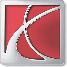
In case you’ve never figured it out, this symbol is meant to be a snippet view (lower left quadrant) of the ringed planet Saturn. It’s strange that the company’s logo is red. Mars is known as the red planet; Saturn is largely pale yellow and blue. But apparently it was just another reason why Saturn was known as “a different kind of car company.”
3 Late-Model Vehicles We Really Didn’t Need
Subaru
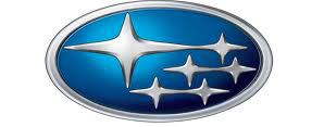
What do Ford, Lamborghini, and Subaru have in common? Not much, except they all are obsessed with the Taurus constellation. The Ford Taurus is a popular large sedan, and the bull on the Lamborghini badge represents the founder’s Zodiac sign, Taurus. The Subaru logo represent the six stars of the Taurus constellation that are visible to the naked eye—as well as the six companies united under its parent company, Fuji Heavy Industries. In fact, Subaru in Japanese means “unite.”
Toyota
With its two ovals within an oval, Toyota accomplished two things. From a distance, the two perpendicular center ovals look like the letter T (kind of). But more importantly, the company asserts, “the two perpendicular center ovals represent a relationship of mutual trust between the customer and Toyota.”

Nicely Suited: The Designer Series Lincoln Mark V Models of 1977
Volvo
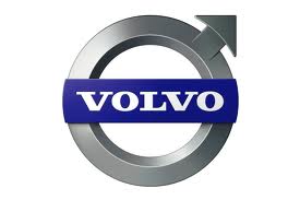
The circle with the arrow that points upward to the right may seem simple, but it means a lot to the Swedes. It symbolizes the masculine gender as well as the Roman god of warfare (Mars). Because Mars represents strength, the iron industry adopted the symbol. To Volvo, the emblem connotes iron, steel, and strength as well as properties the company is proud of: durability and safety.
12 Classic Chevrolet Trucks (Gallery)
Listen to the very entertaining Consumer Guide Car Stuff Podcast
Car Company Logos
Car Company Logos
Car Company Logos

